| The Mobile Web | Back | TOC |
PART 2 [Continued...]
PART 1
The Mobile User Interface
In the previous section we have taken a look at the midlet life cycle. The midlet is the entry point of an MIDP application, and programmatically the class that extends the MIDlet class is a midlet, and allows the developer to invoke, pause, re-start and destroy a midlet.
In this section we will consider programming the user interface for the small screen.
The user interface is based on the notion of a screen. It means the amount of content that can be reasonably presented to the user at a time. Each screen is equipped with its own command set to perform tasks such as navigation (previous, next, exit), item selection from a list, scroll up or down a screen, and confirming acceptance of a selection.
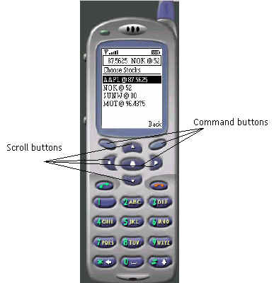
Here is a screen shot of the various components of a screen.
The buttons of the device not named in the picture shown above are also programmable. They belong to a group called the Game Actions. Many gaming applications have been written for the small screen, and the buttons on the number pad are used for actions in a game like move, strike and kill. The interface may differ with the make of the device, but they all contain the same set of buttons.
The command buttons can be programmed to set the following commands:
Usually only up to two commands can be set to the command buttons that lie to the left and right of the device, also called the soft keys. if, however, more commands are set than can be physically mapped to the two buttons, then the device shows them all in a separate screen. The center command button is set to OK, and is usually set to make a selection from a list, or to activate a text field.
The Command class is assisted by the CommandListener class to propagate the command events to the class that implements the listener. Again, you will notice that it is similar to the event notification mechanism of standard Java. A Command can be created by the following code snippet:
Command ok = new Command("OK", Command.OK, 1);
As you can see from the argument list of the Command class constructor, the command has a label represented by the first argument. The other two arguments are the command type and the command priority. The Command types are:
We will see examples of them and more in Part 3. Let us look at other user interface elements such as:
A Form is used to add one more user interface items to a screen such as a text field, a date field or a set of radio buttons and check boxes, or all in one form. It may also contain images, read-only text fields and gauges (a.k.a. progress bars). The item mix in a form screen can be arbitrary, and the form as a whole scrolls (a device-specific feature). While a form may be used to show images, you may find the Canvas class more suitable for drawing images or producing animations on the screen.
A List contains selectable items. Only one item in a list can be selected, and the selection is made by the center button, the OK command, though you can program one of the soft keys to activate a selection.
A ChoiceGroup specifies whether you want a single selection (radio button functionality) or a multiple selection feature (check boxes). The Choice interface API provides the mechanism to manipulate the List items and the elements of a ChoiceGroup.
So far we have speaking of items. But what is an Item? Item is a super class of all user interface elements such as a StringItem for text, and ImagerItem for images. A StringItem is a read-only text that can be displayed in a Form.
A TextField is the counterpart of a HTML text object providing a scrollable text interface to the user, and has a maximum length specified. A TextBox, on the other hand, is one that can contain text that can be displayed as a screenful at a time, or if the contents exceed the screen capacity, a scroller is presented to the user, transparent to the application developer. The maximum amount of text that can be displayed in the box depends on the device storage.
Alert is way of displaying information like successful, exceptional or error conditions to the user. An Alert screen can be displayed for a timed interval after which it can be dismissed programmatically, or provide a soft key press to the user for dismissal. The Alert is usually set to return to the previous screen after it is dismissed, though there is no hard and fast rule.
DateField is a device dependent display of a Calendar and the means to select a date. It can be set to display the current date or allow the user to select a date. The Date format is usually mm-dd-yyyy, though this can be manipulated by the Date and Calendar classes available in the utility package.
Ticker tape displays have become common now to provide the user with the latest updates on stock quotations, price movements and so on. The MIDP specifies a Ticker class that just does this job transparent to the application developer, for the implementation is device-dependent. It is usually displayed on the top of the screen and consists of a text string that scrolls usually from right to left. The speed and direction of display are left to the device that implements it, as also the starting and stopping of the ticker, upon which the developer has no control.
The Canvas class allows you to draw images. A touch-screen device can take advantage of this feature to allow the user to make selections on the screen with a pointing device. The images on the screen can be marked up and mapped to provide application specific functionality. A game program like chess can benefit from this functionality. We will see how to program the Canvas class in the Part 3 of this series.
This completes our whirlwind tour of user interfaces. In the next section we will see how to store information in the device, and also how to retrieve it. Fondly called the mobile database, the MIDP specification defines what is called a RecordStore for the mobile device.
To be continued...